Nimruz
A rebrand and content system for a platform cultivating Iranian culture.
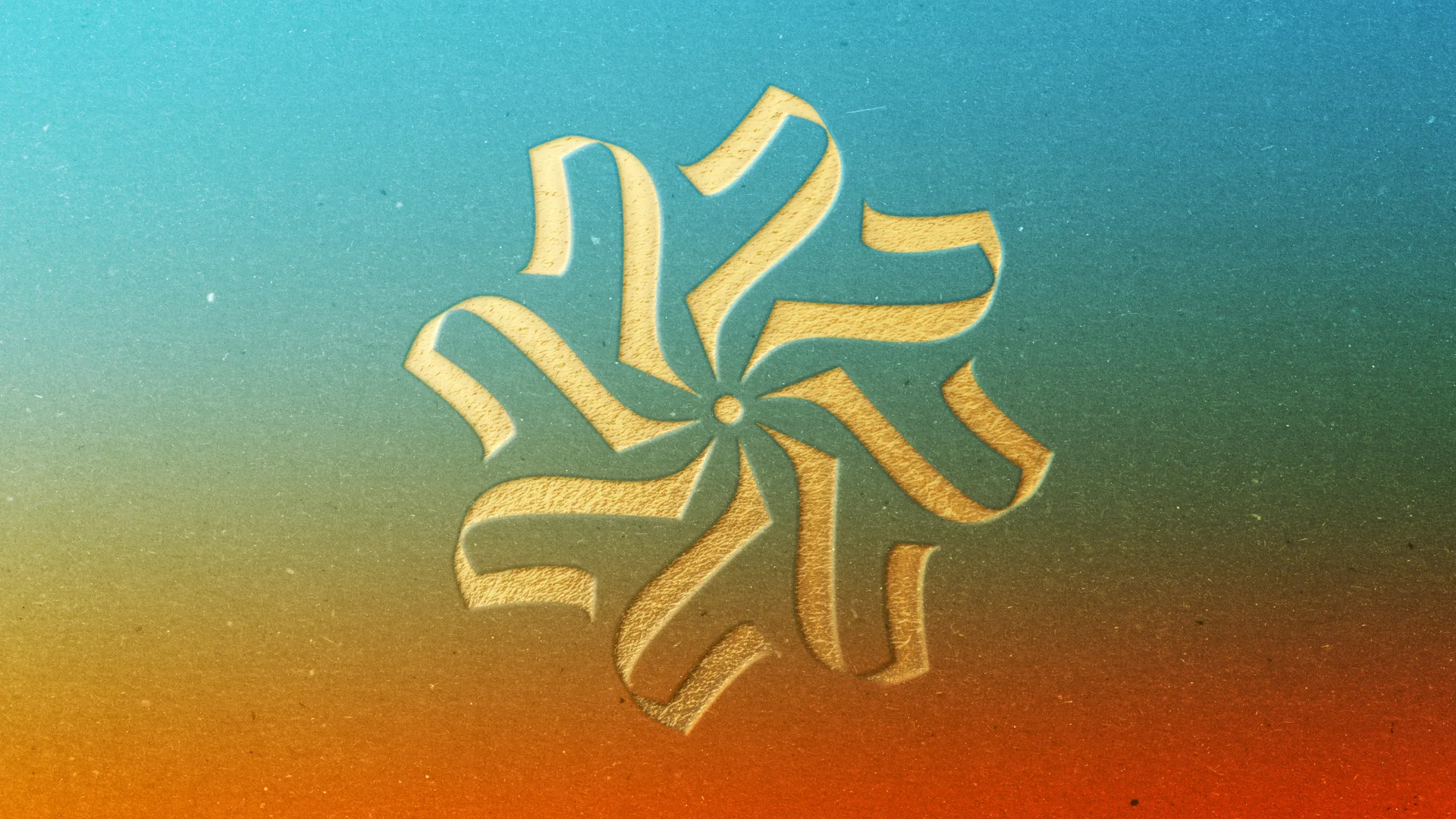
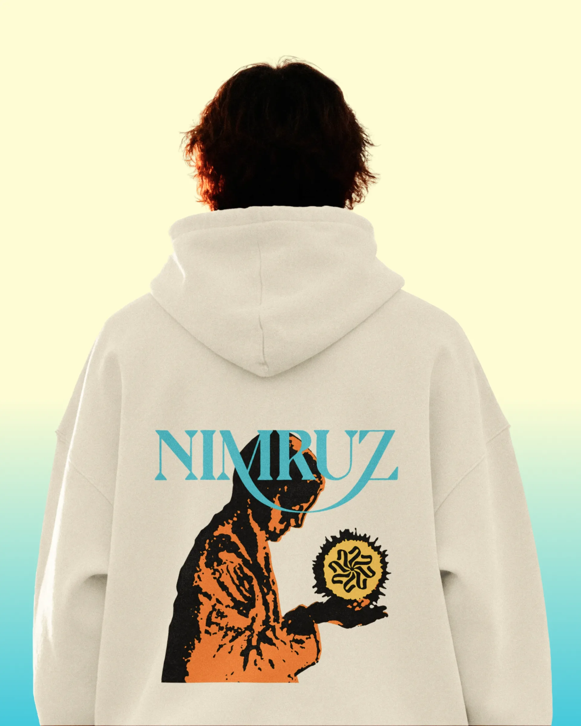
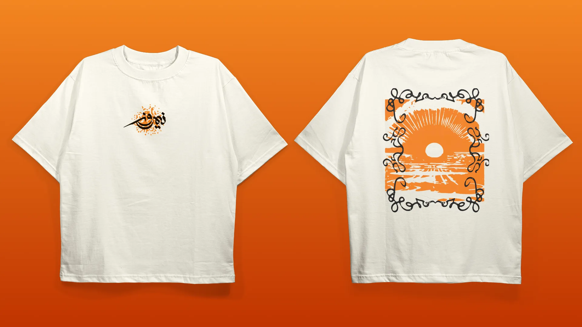
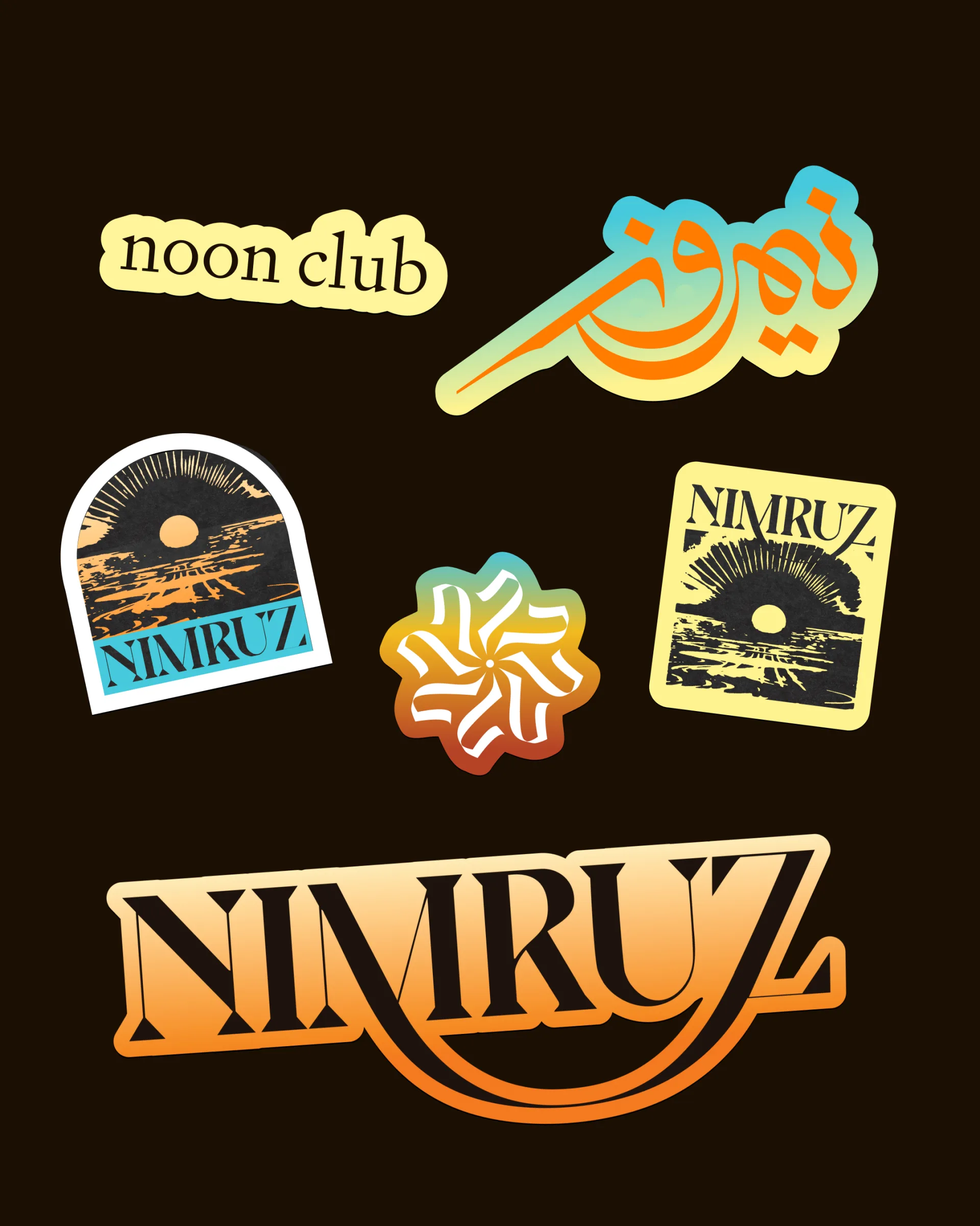
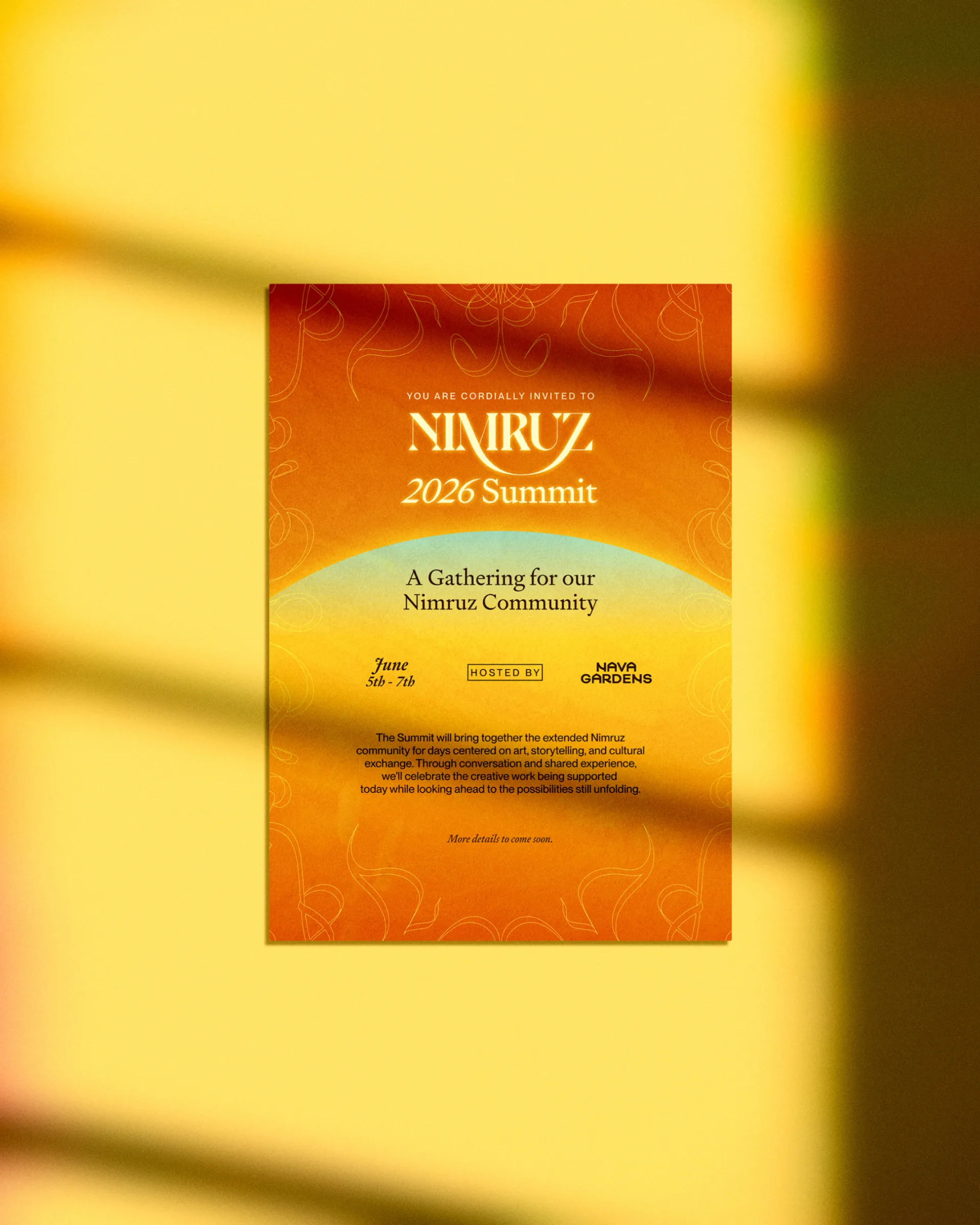
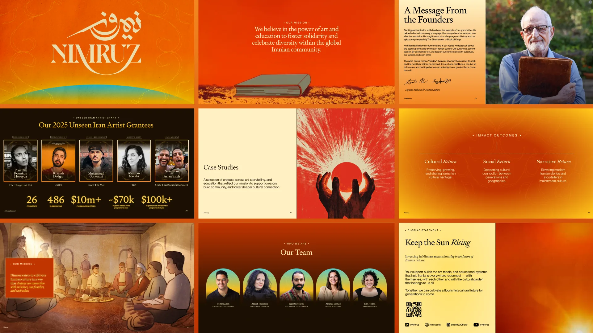
Nimruz set out to do something needed and relevant: cultivate Iranian culture for a new generation, in a way that feels warm, modern, and rooted all at once. They came to us with an established name and wordmark — Nimruz, the land of the midday sun — but a visual world that hadn’t yet caught up to the vision. So we rebranded: a near-total overhaul that kept the existing wordmarks untouched and rebuilt everything around them. We introduced a new sun brandmark as the anchor, then extended it into a sun-drenched visual language drawn from Persian art and architecture, a system of calligraphic flourishes, and a content framework designed to run across social every day without ever losing its soul. The result is a brand that feels like home and reads as new.
Introduced a new sun brandmark and rebuilt the full visual system — palette, motifs, and motion — around the existing wordmark, grounded in Persian art.
Built a modular content framework the team runs independently across social, day in and day out.
A brand that reads as both deeply familiar and unmistakably contemporary — heritage on one side, right now on the other.
The Vision
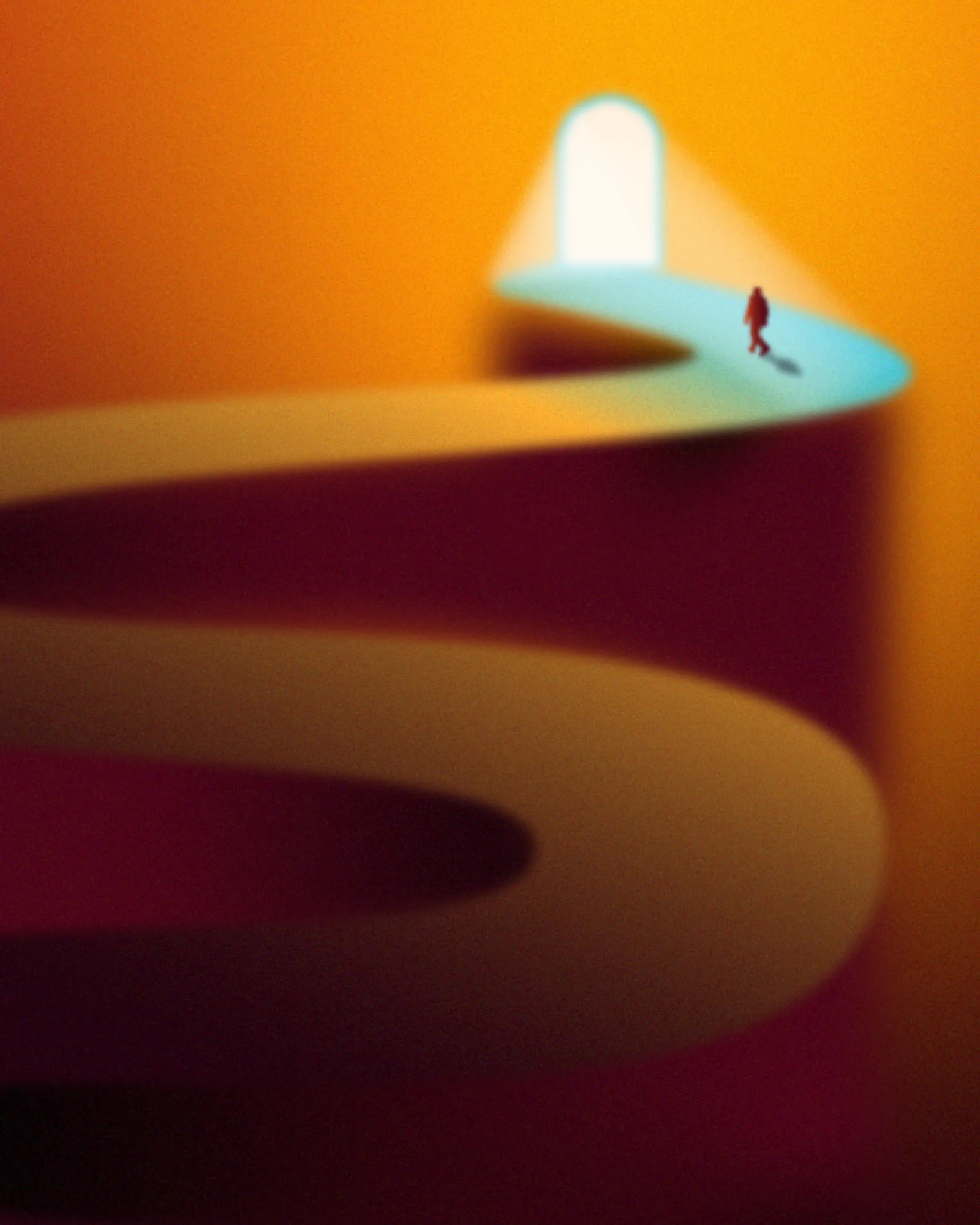
Nimruz means the land of the midday sun — the place where light is at its fullest. That idea became the center of gravity for the entire brand. Everything radiates warmth: sunrise gradients, golden hour tones, and a sensibility that treats heritage not as a museum piece but as something living, generous, and worth passing on.

The Challenge
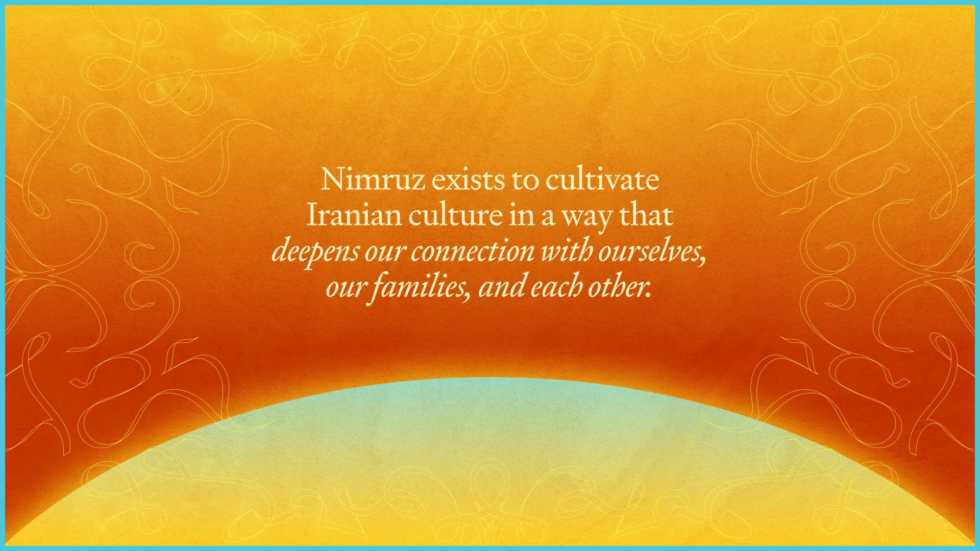
Cultural brands walk a narrow line. Lean too traditional and you speak only to the past; lean too modern and you lose the thread entirely. Nimruz needed a language that could hold both — reverent enough to honor Iranian art and identity, contemporary enough to live natively on a phone screen and earn a place in a young audience’s feed.
The System
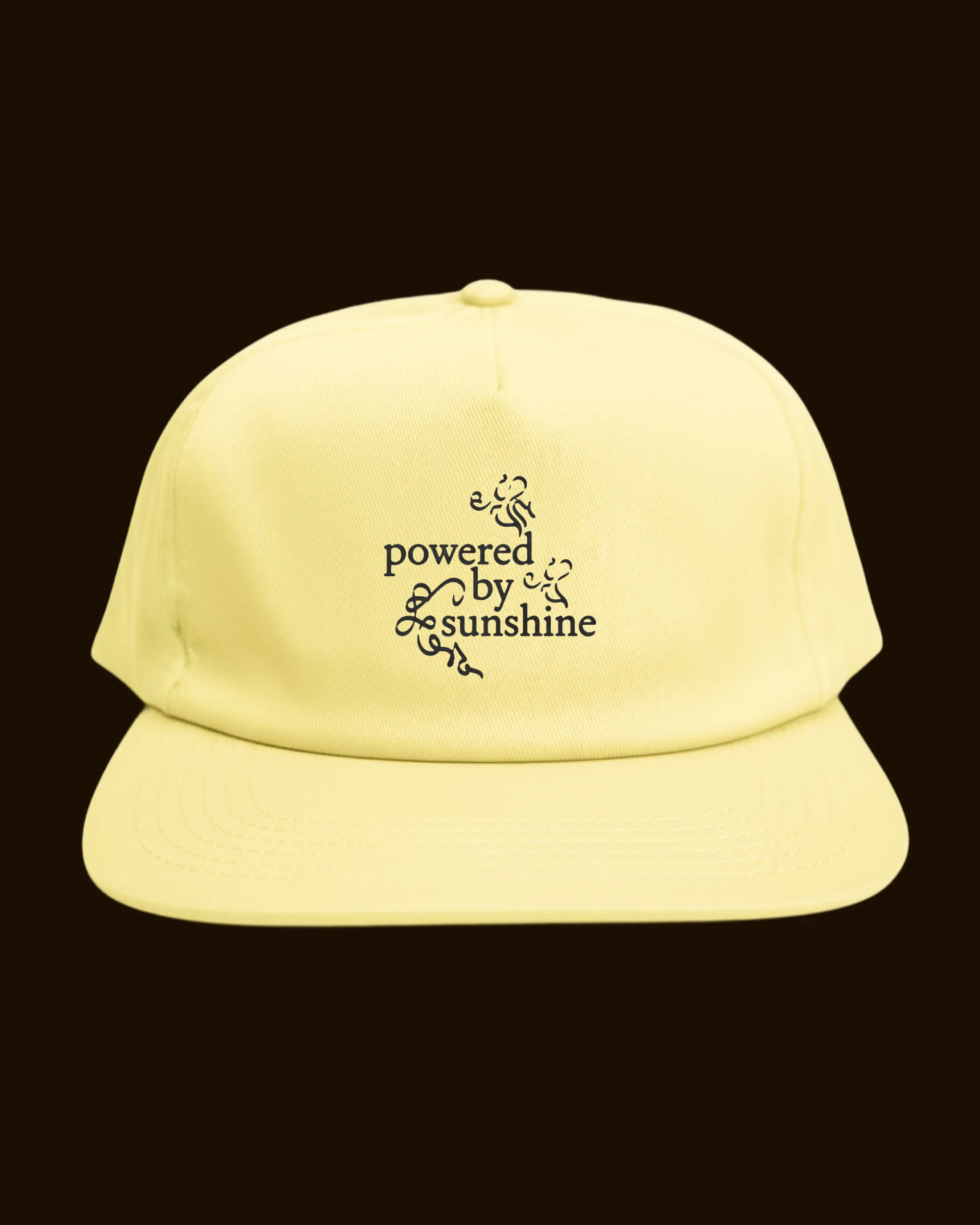
The overhaul centered on one new element: a sun brandmark, designed to sit alongside the existing wordmark rather than replace it. From there we extended a full toolkit — a warm, saturated palette pulled from Persian miniatures and tilework, and a library of calligraphic line flourishes that give every layout a handmade signature. It all flows naturally into apparel, editorial, and a content system the team can run on their own.
In Motion
Static was never going to be enough. We designed the brand to move — suns that rise, flourishes that draw themselves on, the wordmark catching the light — so that every post carries the same warmth in motion as it does on the page. The content system turns that language into a repeatable, ownable rhythm the team publishes against every week.